Item Browser
Reusable component for ArcGIS Online
I designed this shared component for finding content in various workflows of ArcGIS Online. This is an extension of the Finding and Working with Content experience.
Background
In ArcGIS Online, users create maps by assembling layers in the Map Viewer, similar to adding layers in a Photoshop file. Users can add layers from all available content scopes (their own content, favorites, groups, organization content, and public content). I worked as the UX designer with a small team to build a reusable component that could be used across ArcGIS Online.
Problem to solve
The legacy design for browsing and selecting layers looked like this:
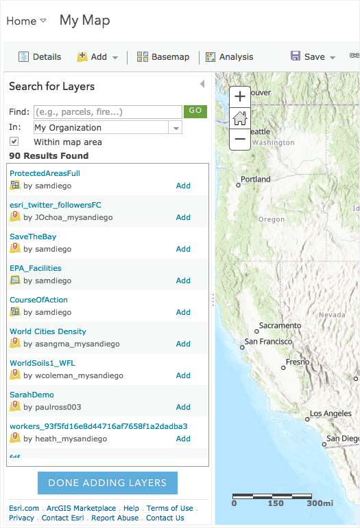
The lack of layer details, filter, and sort limited the user’s ability to discover unfamiliar content. Many users spent time in adding and removing layers in the map to check what they were, or opening multiple browser tabs to view details of the layers.
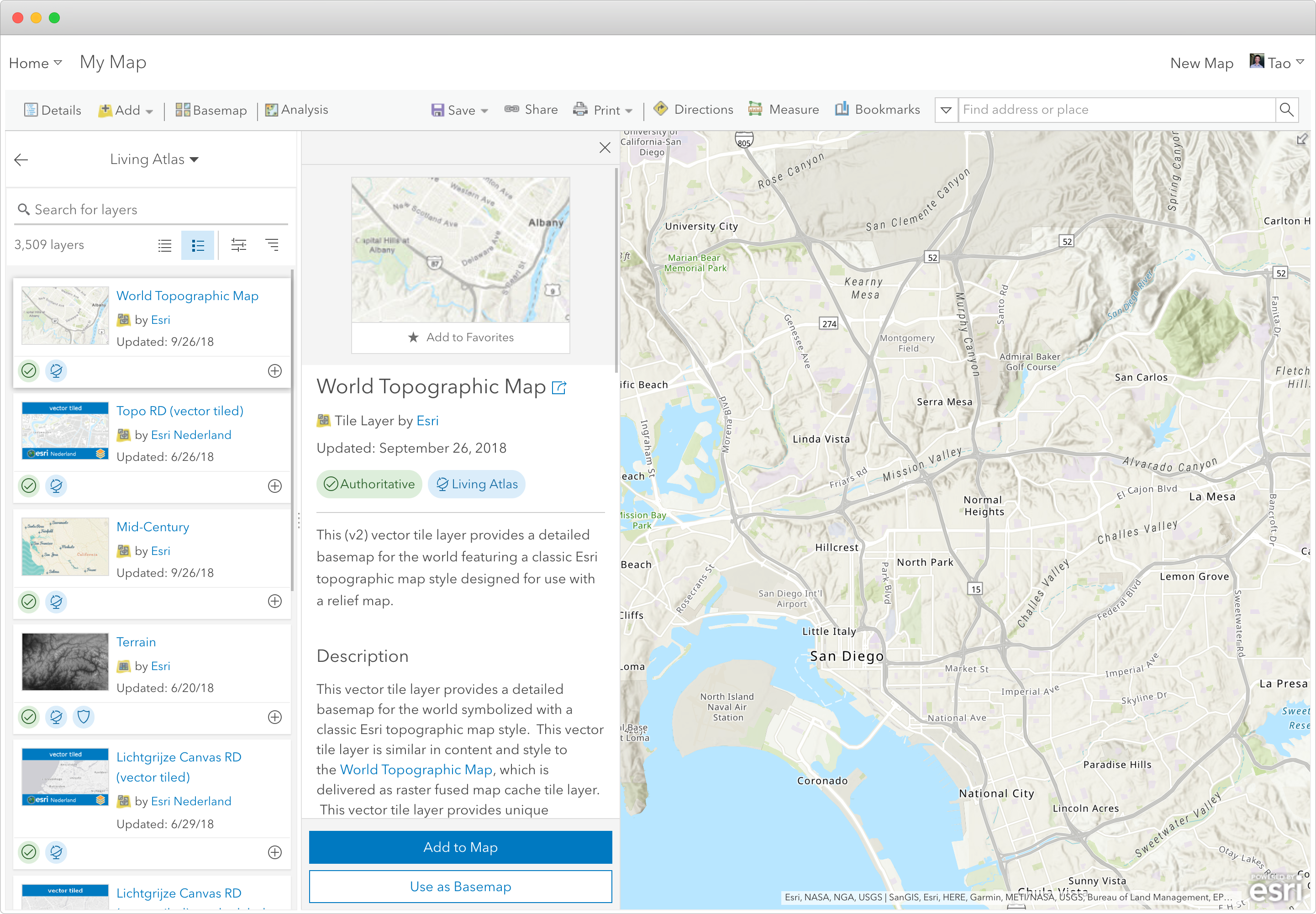
Design
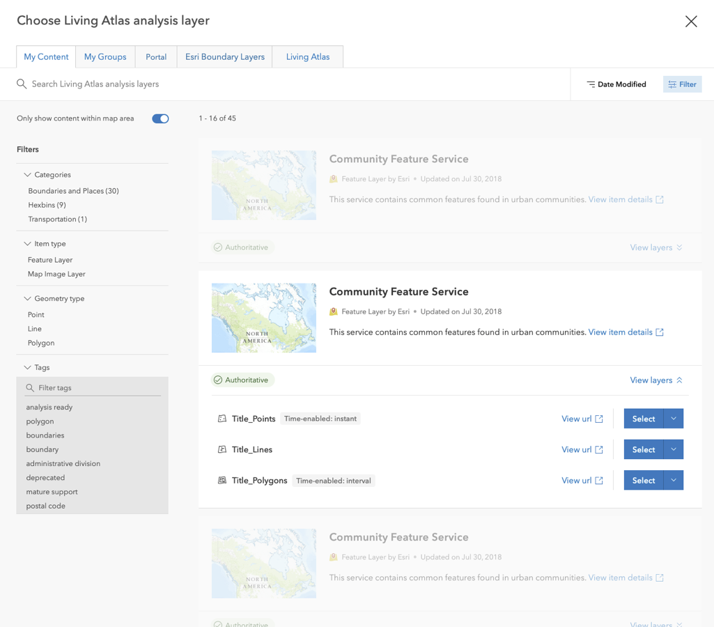
I applied design patterns and many UI components from the ArcGIS Online’s content management design.
Components
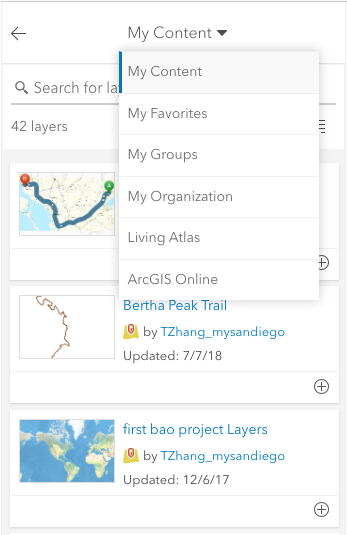
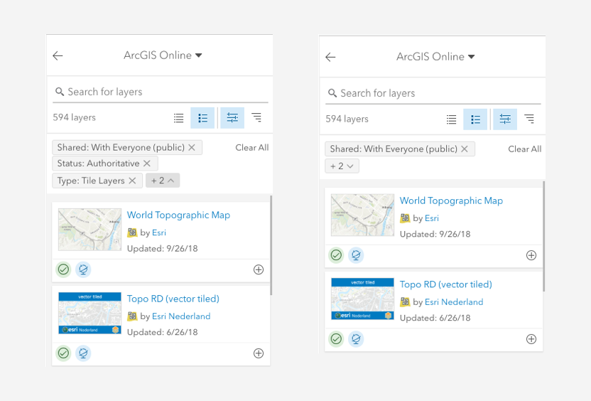
Scope switch
I used a dropdown menu for the user to switch one content scope to another (e.g., from My Content to My Groups).
Side panel
The user needs to know more details about unfamiliar layers. With the limited space, I designed a side panel to show layer details.
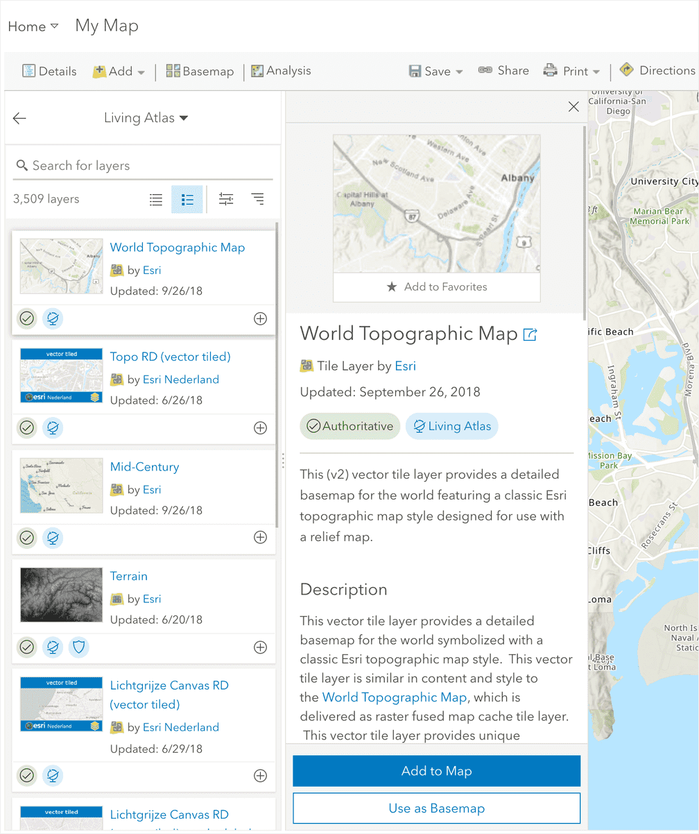
Filters
I used another side panel to show filters for refining the content list. This allows the user to apply filters and see updated content list at the same time.
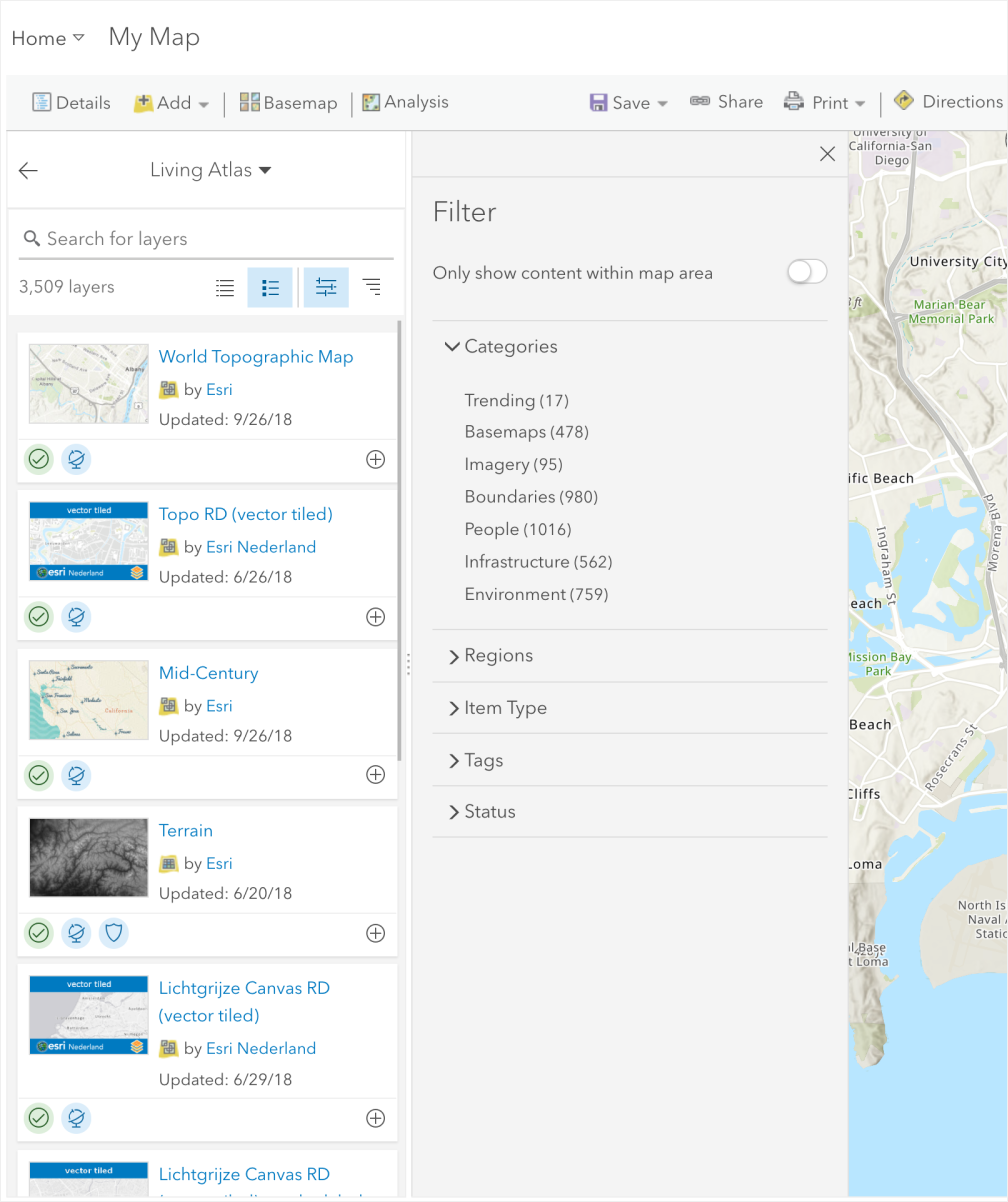
Filter chips
Applied filters (chips) can be collapsed to give the user more space to view the content list.
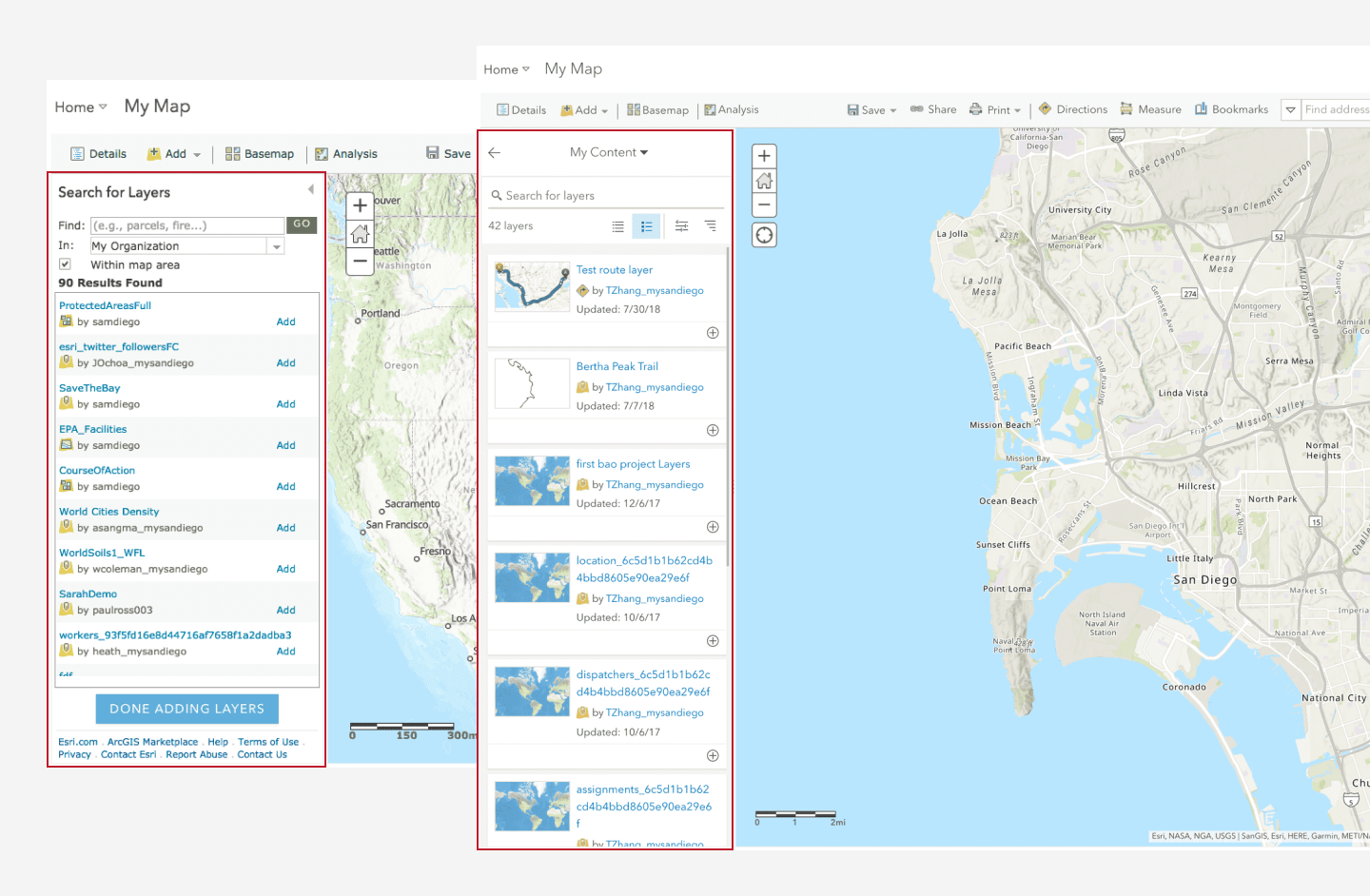
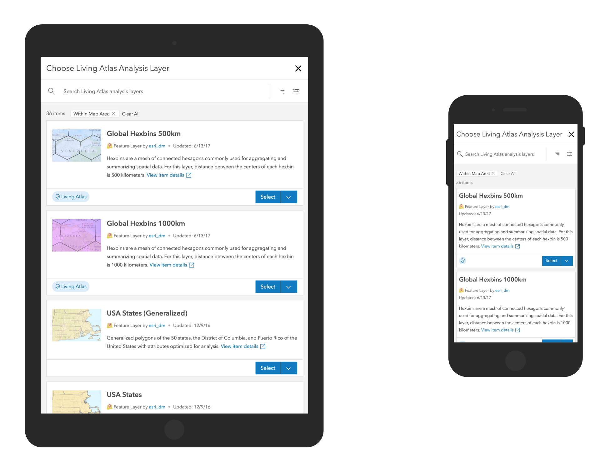
Responsive layout
Many patterns and relationships are not always obvious by looking at a map. ArcGIS Online provides powerful analysis tools that quantify patterns and relationships and display results in the map. During the analysis workflow, users often need to add additional, unfamiliar layers to the map. Before the new design, users interacted with a legacy dialog that did not have filters and lacked a lot of important information of the layers.
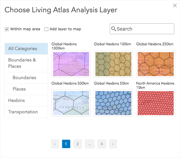
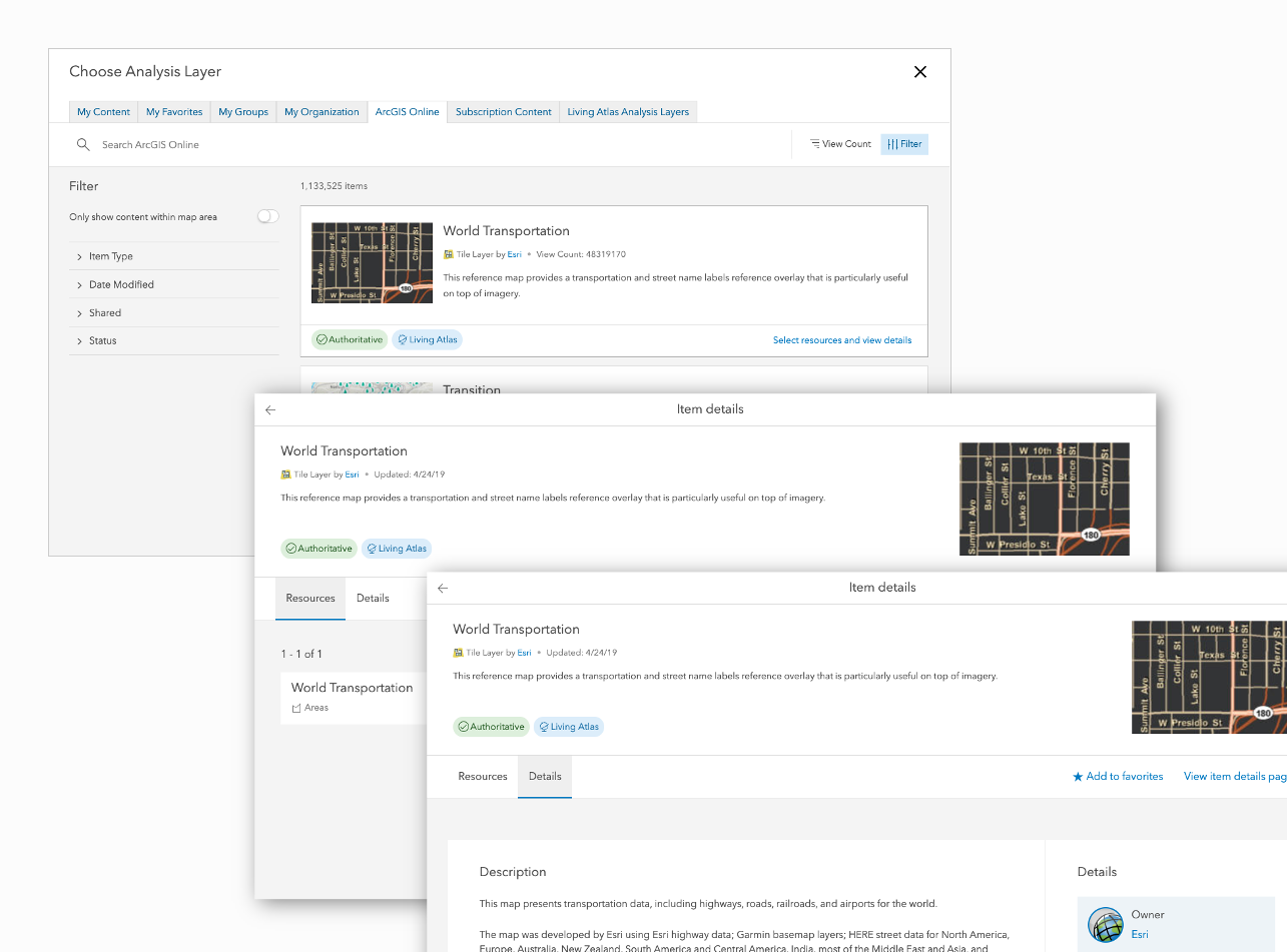
With the responsive layout, I adapted the item browser component to a full-screen dialog, and it works across all screen sizes.
Support sublayers and details
As the other Esri teams started to adopt the Item Browser component, a new requirement came up that required the component to display sublayers and details about the layer.
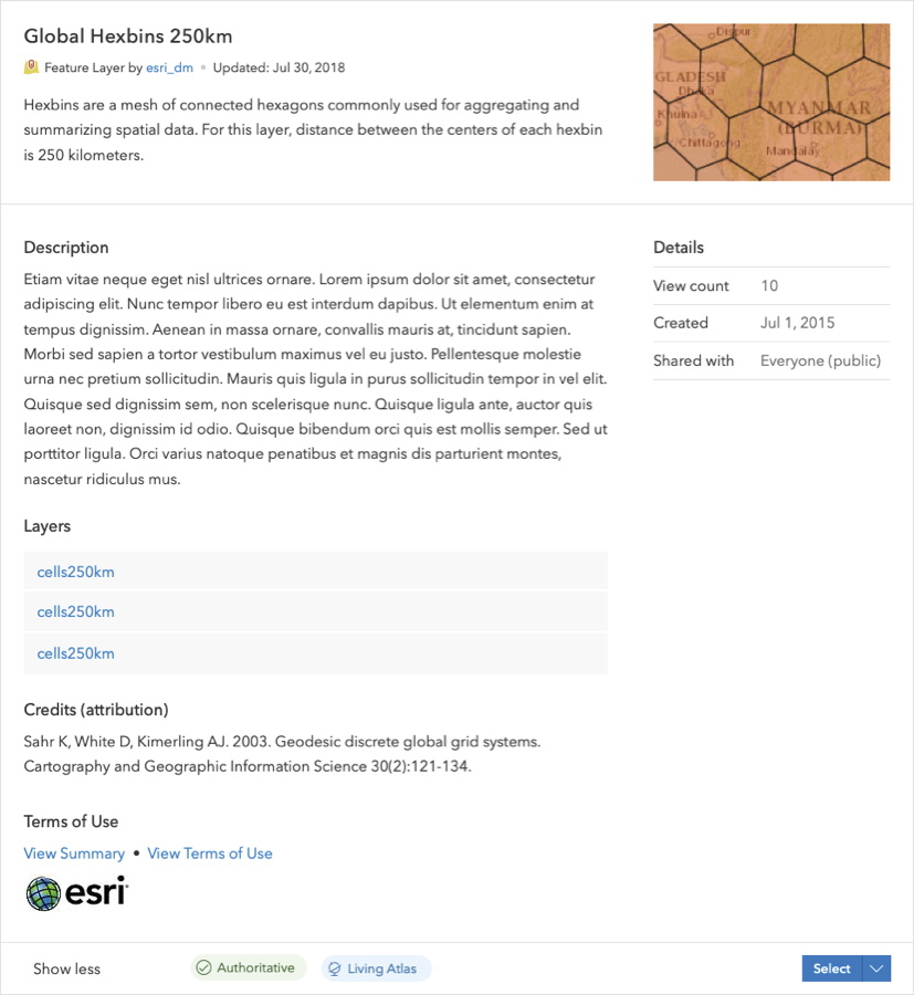
My initial idea was to expand the card to show the sublayers.
This did not work well when there are many sublayers or the layer details is long.
I also experimented using tabs to show different sections of the details and thus reduce the height of the expanded card.
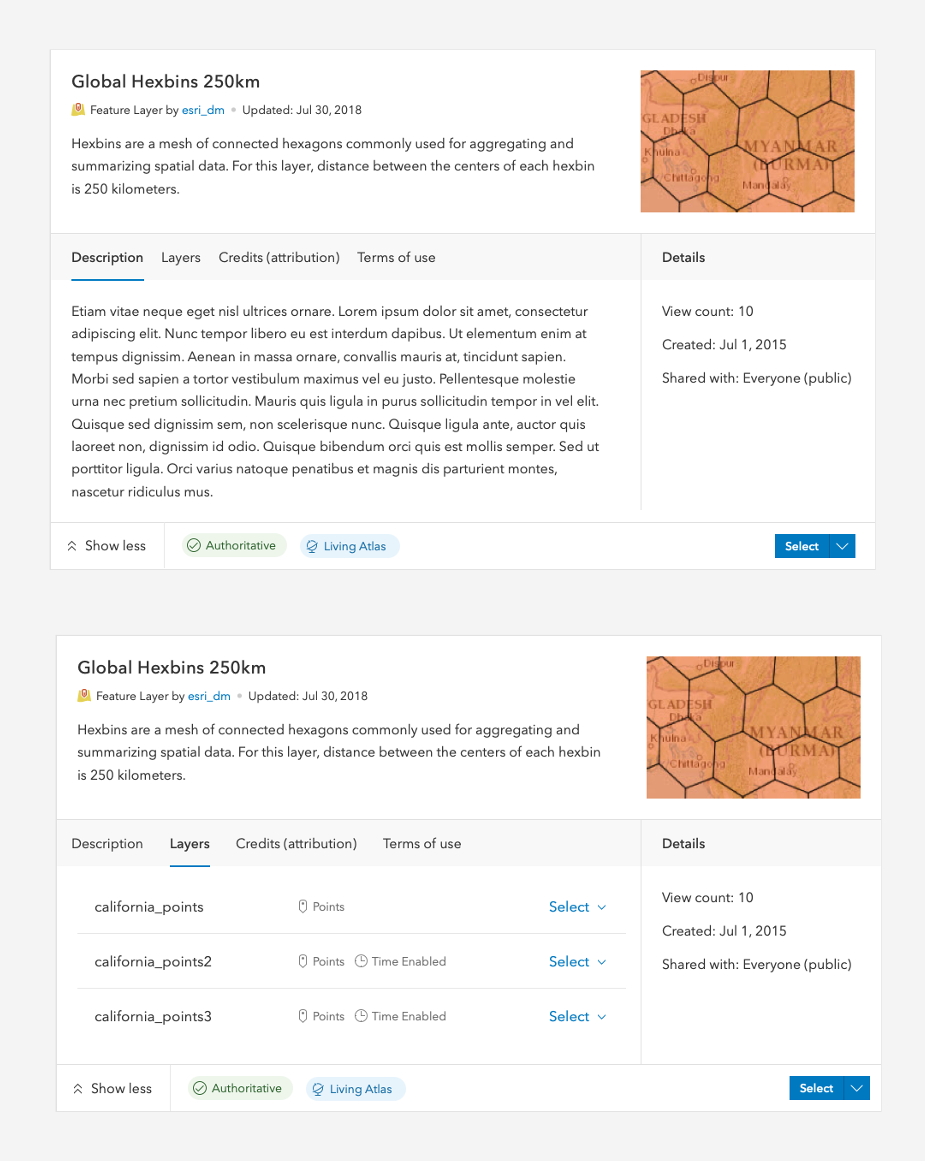
But in user tests, most users felt the expanded card made the list of content very busy.
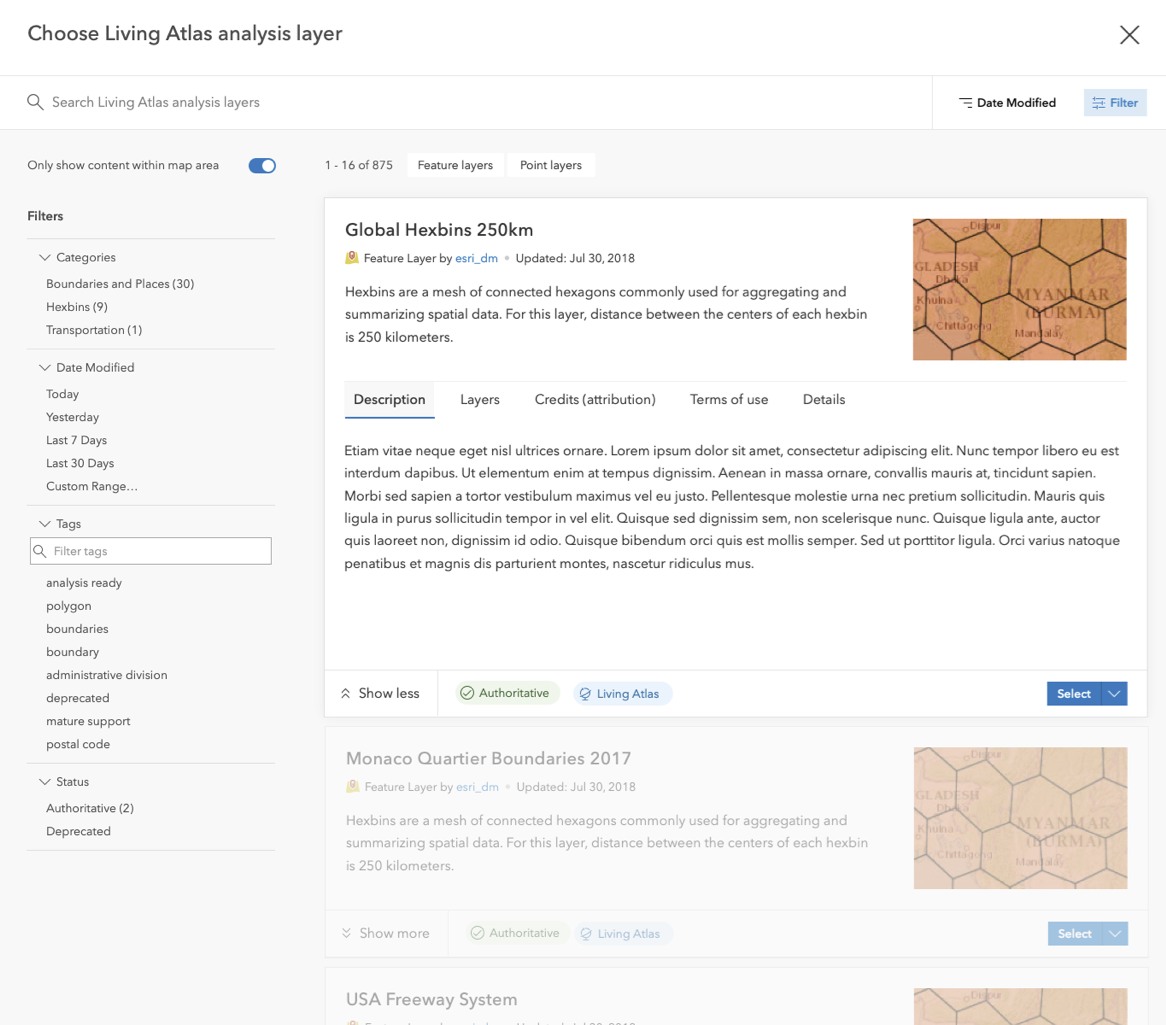
In the end I kept the tabs, but used a drill in pattern for the user to see sublayers and details. Note that I removed the close button on the detailed screen, as I did not want the user to accidentally close the whole full screen dialog.
Impact
We added the full-screen dialog component and drill in pattern to Esri’s design system. Anecdotal feedback showed users loved the Item Browser, as it helped them be more efficient in the Map Viewer. Since the Item Browser’s release, weekly map creation by users increased by 35,000 (8%).